Brand - PI Logo
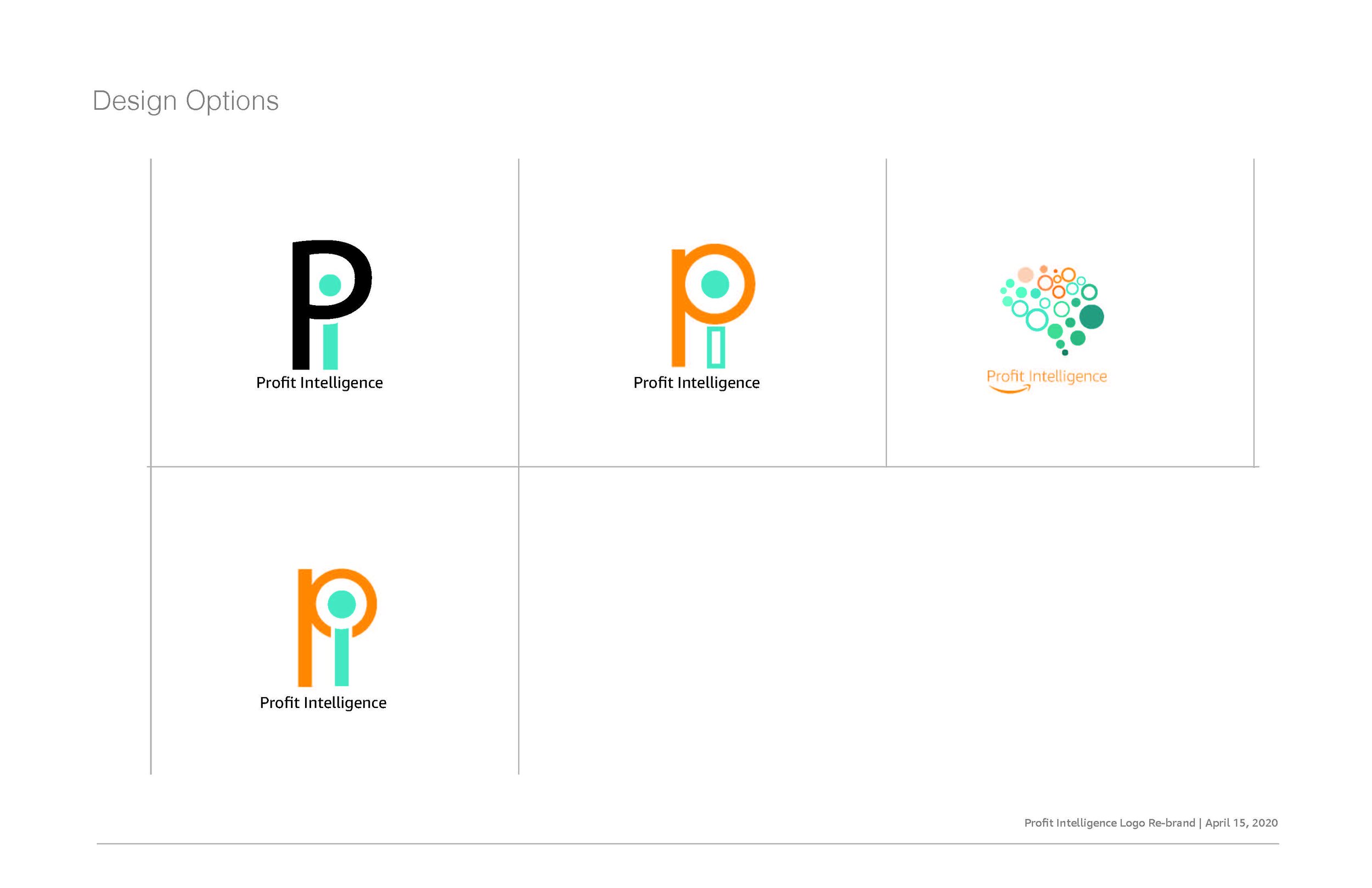
The original Profit intelligence logo was very busy and complex. It became that way after attempting to layer in several aspects or the org. The challenge was to keep the meaning but simplify the logo. The brain is the most obvious element of the logo, using the various circles to represent team work and diversity was a more sublet approach.
Orange: Focus, vibrance
Blue: Trust, loyalty